🌐 Web Accessibility
What is Accessibility?
In short, accessibility is the practice of ensuring our websites and applications are usable by everyone. It's important to provide equal opportunities to all our users regardless of any disability or circumstance, which could be a physical or visual impairment.
Accessibility isn't solely related to a disability either. Here are a couple of examples to illustrate that.
- It could be a parent holding their child, relying on keyboard support to do their job.
- It could be a user living in an area with slow network connections, more on this later.
Accessibility Benefits
- By using semantic HTML we help users with screen readers.
- Search engines ignore your sites styles and rely on the markup, so using semantic elements have the added bonus of increasing SEO, which will make your site easier to find for users.
- It's the right thing to do. Providing equal opportunities to all users demonstrates good ethics.
- From a developer standpoint, semantic elements help improve the readability and maintainability of code. When reviewing code, it's much easier to visualize the UI layout, and much nicer to read with semantic elements like section, nav and header over nested div and span elements.
Tackling Accessibility?
From my experience so far, accessibility doesn't seem to be a first-class citizen in the world of web development just yet. Instead, it's usually an afterthought when a client requires your tools and services to comply with accessibility standards.
Like most things, the cost of implementing accessibility is cheaper when considered from the start of a project. However, it's not all or nothing. You can start implementing accessibility best practices starting now and chip away at the rest of your codebase when you've got some downtime. It's unrealistic to aim for 100% accessibility on your sites (ignoring Lighthouse score), but any considerations for accessibility are better than none.
Don't panic if you don't have any experience in web accessibility. I remember being asked in an interview a few years ago if I had any experience with web accessibility, my answer was a hesitant no.
I'm by no means an accessibility expert, but I enjoy the area. Any learnings throughout writing this article have been applied to the semantics and layout across this blog.
Without any hands on experience, it can be tricky knowing where to start making improvements around accessibility. Hopefully this article will help you take some of those first steps. Here are some important areas to focus on.
Focus Areas
- The Accessibility Tree
- Color Contrast Ratios
- Semantic Elements
- Keyboard Support
- Bandwidth / Network Speed
The Accessibility Tree
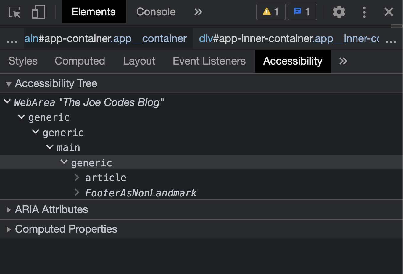
We can view the accessibility tree for our DOM structure by navigating to the "Accessibility" tab in Chrome dev tools. The majority of assistive technologies like screen readers interact with this tree.
From a developer standpoint, we don't really need to worry about the accessibility tree to much, instead we should focus on writing semantic markup. It's the browsers responsibility to create this accessibility tree from our semantic DOM structures and expose it as an API for assistive technologies to use. It's also the browsers responsibility to ensure any user actions from assistive technologies fire the correct JavaScript events.
Colour Contrast Ratios
We should ensure the colors we are picking for our readable content have a color contrast ratio of 4.5:1 or greater. This is the luminance contrast ratio between the text and background, which is the AA standard set by the WCAG (Web Content Accessibility Guidelines). By using colors with a sufficient color contrast ratio, we increase the readability of our content for users with low vision or a color vision deficiency.
Emulating Vision Deficiencies
We can use Chrome's built in vision emulator to get a better insight into how our site's colors look for users with different types of vision deficiencies. Open dev tools, navigate to "more tools", select the "rendering" option and choose from the available vision deficiency emulation options under the "Emulate vision deficiencies" dropdown.
Checking Ratios
There are a number of ways to check your application colors have a 4.5:1 ratio. Some include:
- Online color contrast ratio checkers, like WebAim.
- React Axe as a development tool can be nice for local auditing and guidance. Although, I've been having some issues with it recently playing nicely with the colors across my blog, unsure if it's related to using CSS custom properties or Sass. React Axe will also provide errors when element semantics are incorrect, more on this later.1import React from 'react';2import ReactDOM from 'react-dom';34if (process.env.NODE_ENV !== 'production') {5 import('@axe-core/react').then((axe) => {6 axe(React, ReactDOM, 1000, {}, '#root'); // optional 5th arg node or arr7 });8}
- Chrome offers some awesome built in automation tools and developer tools to aid with accessibility. If you navigate to the Lighthouse tab within Chrome dev tools you can run a report which provides feedback on the accessibility of your site. Under the hood, Chrome dev tools uses the axe-core library.
I think it's important to note, don't rely entirely on Automation tools. Lighthouse should only be used as a baseline to improve on, manual accessibility auditing should still be carried out and built into your development process throughout the design, code review, testing and deployment phases.
Resolving Contrast Issues
In the video below, I installed React Axe as a development dependency and used the feedback provided in the developer console, in combination with Chrome's built-in accessibility tooling, to debug and select a colour with a high enough AA standard contrast ratio.
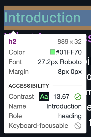
Notice when you hover over an element using the target selector, you get a tooltip displaying important accessibility information. This popover can be super useful to quickly verify if an elements color contrast ratio is high enough, and if the element is reachable via keyboard.
Depending on your setup, it may be tedious to individually select each element and check the colour contrast ratio. Chrome dev tools offers a nice feature to capture all colour contrast ratios at once.
Navigate to the settings cog, select the "Experiments" menu option and turn on "CSS Overview". You may need to reload dev tools to see this new tab. Once you've enabled the CSS overview tab, navigate to it and click the "Capture overview" button. From here, you can see lots of useful information around your styles, but we're only focused on accessibility for this article. You can see any of the elements that are not complying with AA color contrast ratios, select them and fix using any of the methods previously outlined.
Semantic Elements
In this section, we'll take a look at some of the structural semantic elements we can use to improve accessibility.
Nav
The nav element is only intended to be used for your main navigation links. If you've got a set of sub navigation links, you don't need to wrap them in an additional nav element.
Typically, the nav element will contain a series of links acting as your sites primary navigation. However, it does not have to be! it's perfectly valid to include small pieces of textual content inside, as long as its main focus is to display navigation links. See the examples below for use cases outlined above.
It's also advised to use nav element for breadcrumb navigation, adding an aria-label with "breadcrumb" is also a nice touch to help out any users on screen readers.
Quick note on aria-label vs aria-labelledby: aria-label lets you write the label directly as a string attribute when there's no visible text to reference. aria-labelledby points at the id of an existing element that already has the label text visible on screen. For example, if you have a visible h2 that reads "Site Navigation", use aria-labelledby="nav-heading" rather than duplicating the text in an aria-label. This way screen readers read the same label your sighted users see, keeping things consistent.
1<!-- most common use case for nav element -->2<nav aria-label="Primary">3 <ul>4 <li><a href="/articles/sass">Sass</a></li>5 <li>6 <a href="/articles/javascript">Javascript</a>7 <!-- Notice how the <nav> element does NOT added again -->8 <ul>9 <li><a href="/articles/javascript/promises">Promises</a></li>10 <li><a href="/articles/javascript/vanilla">Vanilla</a></li>11 </ul>12 </li>13 </ul>14</nav>1516<!-- Breadcrumb example using nav element -->17<nav aria-label="Breadcrumb" class="nav-breadcrumbs">18 <ol>19 <li>20 <a href="../articles">21 Articles22 </a>23 </li>24 <li>25 <a href="../articles/javascript">26 JavaScript Articles27 </a>28 </li>29 </ol>30</nav>3132<!-- nav example with some text content -->33<nav aria-label="Primary">34 <header>35 <h2>All Articles</h2>36 <p>Select all available articles below.</p>37 </header>38 <ul>39 <li><a href="/articles/sass">Sass</a></li>40 <li><a href="/articles/typescript">TypeScript</a></li>41 </ul>42</nav>
Section
We can think about the section element as a standalone piece of the document. These are usually generic, where there isn't a more fitting semantic element to use. It's important not to swap out all div elements for section elements. In most use cases, a section element should always have a heading element to describe the purpose of the section. Some nice questions to ask yourself if you should be reaching for a section element:
- Can you describe the content area with a meaningful heading? If the answer is no, a div element is likely the better option.
- Is the element only meant to act as a container, or for attaching some styles to? If the answer is yes, then a div element is likely the better option.
1<!-- Avoid using as container or style wrappers -->2<section class="style-wrapper">3 <p> 👾 👾 👾 </p>4</section>56<!-- Instead, use an element with 0 semantic meaning -->7<div class="style-wrapper">8 <p> 👾 👾 👾 </p>9</div>
The section element can be multi level nested if it makes sense for your content. As previously mentioned, you'll want to have a meaningful header element, which could be header itself with heading elements h1, h2, h3 ...etc, or a standalone heading element h1, h2, h3 ...etc. Footers are entirely optional based on your content. One thing to note, section elements that contain header or footerelements, may also contain another section element within the header or footer. See the examples below.
1<article>2 <h1>All Emojis</h1>3 <!-- Nested Sections-->4 <section>5 <!-- Meaningful Heading-->6 <h2>Favourite Emojis</h2>7 <section>8 <!-- Meaningful Heading-->9 <h3>Rocket Emoji</h3>10 <p> 🚀 🚀 🚀 </p>11 </section>12 <section>13 <!-- Meaningful Heading -->14 <h3>Alien Invader Emoji</h3>15 <p> 👾 👾 👾 </p>16 </section>17 <footer>Share on socials... </footer>18 </section>19 <footer>© 2021 TheJoeCodes</footer>20</article>
Header
The header element can be used for introductory content. The most common use case for a header element is to act as container to hold multiple introductory elements, such as heading elements h1, h2, h3 ...etc. The header element is not limited to heading elements, to re-iterate it's for introductory content, which may include a paragraph of text, a profile photo, a logo or anything really depending on your use case.
Header elements can be used within section elements, which is the most common way I use them. For example, an introductory section of an article.
1<article>2 <h1>Web Accessibility</h1>3 <section>4 <header>5 <h2>Introduction</h2>6 <h3>What is accessibility?</h3>7 </header>8 <p>In short, accessibility is...</p>9 </section>10</article>
Footer
The footer element usually contains additional meta data in relation to the site or current page. You will typically see data like legal information, copyright text or links to other related documents like social links or a contact page. You can think about a footer as an element that contains small pieces of supporting information. The content inside a footer element is usually of less importance than the content inside a header element.
1<article>2 <h1>Semantic HTML</h1>3 <p>👋 I hope you're enjoying the content so far 👀</p>4 <footer>5 <p className="footer__author">Author: Johnny McFadden</p>6 <p className="footer__copyright">© 2021 blog.thejoecodes.com</p>7 </footer>8</article>
Article
The article element should be used as a container element to capture self-contained, standalone content that makes sense when placed in a different context.
1<article>2 <h1>All Articles 🧑🏻💻</h1>3 <article>4 <h2>JavaScript</h2>5 <p>... JS post overview ...</p>6 </article>7 <article>8 <h2>TypeScript</h2>9 <p>... TS post overview ...</p>10 </article>11 <article>12 <h2>Sass</h2>13 <p>... Sass post overview ...</p>14 </article>15</article>
I'm currently using the article element in two places across this blog:
- Article post overviews when viewing the list of all articles.
- The article/blog post itself.
Aside
The aside element is used to represent a piece of the document where the content doesn't fit into the normal flow of the main content, but indirectly relates to the main content. You will usually see the aside element used for sidebars which may contain:
- Adverts
- Links to related websites
- Share on socials: Facebook, Twitter, Instagram
- Recommended posts
- Context help on how to use the current page
1<body>2 <header>3 <img>Logo here</img>4 <nav aria-label="primary">primary nav links</nav>5 <nav aria-label="secondary">secondary nav links</nav>6 </header>78 <main>9 <article>10 <h1>Main content heading</h1>11 <p>main content</p>12 </article>13 </main>1415 <!-- Aside element, content indirectly related to main content -->16 <aside>17 <section>18 <h2>Social Media Share Links</h2>19 <ul>20 <li>Share on Facebook...</li>21 <li>Share on Twitter...</li>22 <li>Share on Instagram...</li>23 </ul>24 </section>2526 <section>27 <h2>Recommended Reads</h2>28 <article>29 <h3>Recommend Read 1</h3>30 <p>You should also read this...</p>31 </article>32 <article>33 <h3>Recommend Read 2</h3>34 <p>You should also read this...</p>35 </article>36 </section>37 </aside>38 <!-- Aside element, content indirectly related to main content -->3940 <footer>41 <p className="footer__author">Author: Johnny McFadden</p>42 <p className="footer__copyright">© 2021 blog.thejoecodes.com</p>43 </footer>44 </body>
Keyboard Support
This is one of the most important areas of web accessibility. We should ensure users can navigate our site using only the keyboard. Many users with motor disabilities rely entirely on keyboard support. Here's some disabilities where keyboard support may be required:
- Tremors or issues with fine muscle control.
- My nephew has an issue with his wrists, whereby he can't turn them fully. This impacts lots of areas for him, one being the inability to hold or use a mouse. Instead my nephew relies entirely on either keyboard or mobile support to view and interact with sites on his iPad.
- Other issues with hands, arms or wrists, including a user with no hands at all.
- Users with visual impairments usually rely on keyboard support.
Some users may just prefer to use their keyboard for efficiency.
Focus States
To navigate a sites interactive elements by keyboard, users rely on using the Tab keyboard key. When an element is tabbed to, it's said to be in a focused state, with a corresponding focus ring displayed automatically by the browser.
By default, most browsers display focus states for mouse events, which doesn't look great. I've often seen focused states turned off completely, but we can get the best of both worlds with a little bit of JavaScript and CSS to apply focus states only when using the keyboard. Here's the implementation used across this blog:
1// Let the document know when the mouse is being used2document.body.addEventListener('mousedown', function () {3 document.body.classList.add('using-mouse');4});56// Re-enable focus styling when Tab is pressed7document.body.addEventListener('keydown', function (event) {8 if (event.keyCode === 9) {9 document.body.classList.remove('using-mouse');10 }11});
1/* When mouse is detected, ALL focused elements have outline removed. */2body.using-mouse :focus {3 outline: none;4 box-shadow: none;5}
I was previously using custom focus styles with a box-shadow and a CSS custom property color to work with my various dark themes:
1:focus {2 outline: none;3 box-shadow: 0 0 0pt 2pt var(--primary-color);4}56/* When mouse is detected, ALL focused elements have outline removed. */7body.using-mouse :focus {8 outline: none;9 box-shadow: none;10}
Despite how much "cooler" it looked, it felt wrong to change the focus states which could have been derived from a users operating system preferences.
Navigation Order
It's really important to consider the order in which elements are intended to be interacted with. In most cases, your navigation should flow from top to bottom in a natural and intuitive order.
You should try and avoid using a tabindex property, especially with a value greater than 1. Instead, try using the right element for the job. Instead of reaching for an element with no semantic meaning like a span, adding a tabindex property to make a close button, just use a native button element and remove/update styles accordingly.
1<span tabIndex="1">X</span>23<button aria-label="hide emoji button">X</button>
There may be valid use cases for reaching for the tabindex property. One example of this is a 3rd party design system whereby you can't change the underlying html, the component in question may accept unknown properties and propagate them onto the underlying html element. In this example, a tabindex property might be exactly what you need.
Bandwidth / Network Speed
As we previously mentioned, it's important to consider all our site users, including those impacted by any connection issues like bandwidth or network speed. Some things we can do to improve their experience include:
- Adding descriptive alternative text to images helps users on low bandwidth connections understand the context behind multimedia if it can't be loaded. If you've seen the Google Chrome Developers HTTP 203 video on Writing Good Alt Text, it can be tricky to get this one correct. Adding descriptive text to the image alt property also helps out anyone navigating with a screen reader. I'm definitely guilty of not adding proper alternate text to my images and videos.
- Focus on separation of concerns between your sites content and styles or presentation. By keeping styles in style sheets and avoiding inline styles, you can decrease file sizes and increase download speeds.
- Cache your sites content.
- Adding UI controls to toggle expensive resources like multimedia on/off could be a neat feature for users on low bandwidth.
- Optimize your assets.
- Consider running your SVGs through Jake Archibalds SVG Optimizer.
- Ensure you are using the correct formats for your assets.
- Use SVGs if possible, especially for logos and icons.
- JPEG can be your default format.
- Use PNGs if you need transparency or your image has text in it.
- I usually avoid using GIFs directly since they're so expensive, instead consider converting GIFS to MP4 format (you can reduce the size up to 98%) and use a video element with autoplay, loop, muted and playsinline attributes. This article by Smashing Magazine is worth a read.
This is the TypeScript Media component I'm currently using throughout my blog. We simply pass the type property using a MediaType enum. This component currently supports images, videos and GIFs.
1export enum MediaType {2 Video = 'VIDEO',3 Img = 'IMG',4 Gif = 'GIF',5}
1import React, { FC } from 'react';2import { joinWithSpaces } from '~src/core/utils/array-helpers';3import { MediaType } from '~src/core/types';45type GifVideoProperties = {6 autoPlay?: boolean;7 loop?: boolean;8 muted?: boolean;9 playsInline?: boolean;10 controls?: boolean;11};1213interface Props {14 src: string;15 className?: string;16 type: MediaType;17 altText?: string;18}1920const Media: FC<Props> = ({ src, className = '', type, altText }) => {21 let gifVideoProperties: GifVideoProperties = {};2223 if (type === MediaType.Gif) {24 gifVideoProperties = {25 loop: true,26 muted: true,27 autoPlay: true,28 controls: false,29 };30 }3132 return (33 <div className="media-container">34 {type === MediaType.Img ? (35 <img36 className={joinWithSpaces(['image', className])}37 src={src}38 alt={altText}39 />40 ) : (41 <video42 className={joinWithSpaces(['video', className])}43 playsInline44 controls45 {...gifVideoProperties}46 >47 <source src={src} type="video/mp4" />48 </video>49 )}50 </div>51 );52};5354export default Media;
When we need to switch between a standard video with user controls (play/pause/volume) and a GIF, we just pass in the correct MediaType and the component internals handles the rest for us. Internally, a new set of object properties will be spread onto the underlying native video element to override the existing properties used for videos.
1<Media2 src="https://example.cloudfront.net/videos/example.mp4"3 type={MediaType.Gif}4/>
Final Thoughts
Although this article was a bit longer than previous ones, there is still a range of content we didn't explore. I kind of ran out of steam with this article and felt it was getting a bit lengthy, sorry! Some areas we didn't cover that you can read up on in your spare time include:
- Aria labels
- Screen readers / using screen readers.
- Building accessibility testing into your CI/CD flow. I'll probably cover this in a future article with Cypress.
- Other areas I may not be aware of 🤷
Make sure to check out my latest articles on accessibility:
I've embedded the Google Developers Mini Series on Designing in the Browser with accessibility considerations below. I would highly recommend watching them if you prefer learning through videos, they're awesome.
Here's a quick reference for the four WCAG pillars and what they cover:
WCAG 2.1
- Alt text on meaningful images
- Colour contrast meets 4.5:1
- Captions on video and audio
- Full keyboard navigation
- Visible focus styles
- Skip links to main content
- Clear, descriptive labels
- Useful error messages
- Consistent navigation and UI
- Semantic HTML elements
- ARIA roles where needed
- Valid, well-structured markup
On a final note if you made it this far, it's important to ensure accessibility is considered throughout and across all the pillars of software development, including design, development, and testing.
Extra Learning
Was this useful?
Thanks for reading! Time for one more?
.rem { padding: 1rem; } /* bad: scales with font */.px { padding: 16px; } /* good: always 16px */p { font-size: 1rem; } /* good: rem is right here */
📏 Layouts PX vs REM
14 Sept 2021 • 📖 5 min read • Updated 15 Mar 2026Stop using rem units for CSS box model properties like padding and margin.
while (!valid) {await askDirectoryName({ ui }).then(val => { valid = true; dir = val })}
🚀 Productive Tooling
19 Mar 2021 • 📖 10 min read • Updated 15 Mar 2026Increasing my productivity with custom tooling.