📏 Layouts PX vs REM
Scaling Layouts
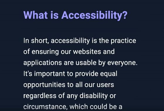
Most blogs (including this one) limit the width of the content area to make it easier to read text line by line through an article. I'm using margin autos to center the content area and padding to add some breathing room. Here's how it looks when you increase the browser's default font size with relative units on layout properties.
Notice how the padding scales with the font size, making everything feel zoomed in rather than just easier to read. Here's the same thing with padding switched to a fixed unit like pixels:
This time, increasing the font size doesn't affect readability. Using relative units only for font sizes is what actually improves accessibility for users who scale their default font size.
Comparison
Here's the end result side by side with a scaled default font size.
rem
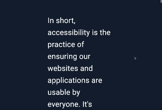
px
Here's another example, this time comparing two buttons in isolation. The first button uses rem units and the second uses px units.
Using relative units when there isn't a large amount of text/sentences to read does work quite nicely to scale everything relative to the default font size.
The css for each of the buttons in the GIF above is:
1button {2 color: white;3 background-color: black;4 border: 2px solid slateblue;5 cursor: pointer;6}78.rem {9 font-size: 1rem;10 padding: 1rem;11 margin: 1rem;12}1314.px {15 font-size: 1rem;16 padding: 16px;17 margin: 16px;18}
Check out the full codepen and scale your browsers default font size to see things in action.
Final Thoughts
When using relative units for font sizes only, content scaling feels more aligned with the original intentions of the browsers font size settings, and not like you've just zoomed the entire website in, breaking the flow of the sentences and making lengthy content areas almost unreadable.
I guess it does depend on the use case, but for the most part I'm really leaning towards avoiding rem for layout properties. I can see relative units working better when there isn't much text to read. The button example shows this nicely.
It feels like using the wrong css units in one way or another is a common mistake in web dev. This Medium article from 2019 is one of the rare articles I could really find in alignment with my findings/testing. It's worth a read!
Extra Learning
Why I use rem instead of px for font-size | CSS
Was this useful?
Thanks for reading! Time for one more?
@mixin responsive($type) {@if $type == mobileMinMax {@media (max-width: 800px) { @content; }}}
📱 Responsive Mixin
23 Sept 2021 • 📖 4 min read • Updated 15 Mar 2026A responsive sass mixin to clean-up your messy media queries.
<button aria-label="Hide emoji">X</button><img src={src} alt="Red warning sign" /><input aria-required="true" aria-label="Name" />
🌐 Web Accessibility
03 Jun 2021 • 📖 23 min read • Updated 15 Mar 2026Tips and tricks, tooling and best practices for web accessibility.